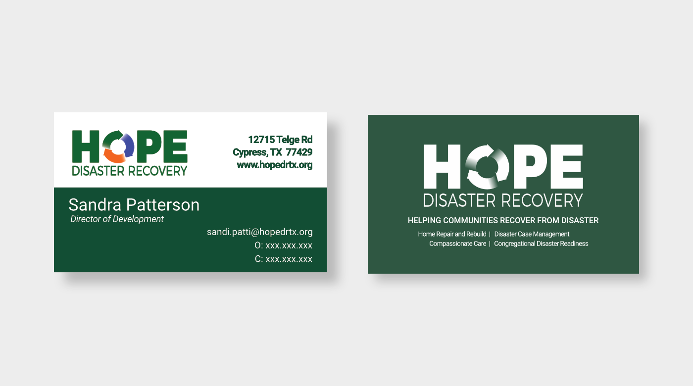
Hope Disaster Recovery
In 2019, Hope Disaster Recovery (HDR) approached me about building a company brand. As a new non-profit focused on rebuilding and repairing homes after disasters, they were looking for bright colors that would grab people’s attention. Additionally, as they were establishing client services, they needed their brand to be comforting and reassuring to those in need.
HDR chose green as their base color as it psychologically connotes growth. From that, the rest of the brand was born. We rebuilt their website, gave them business cards, letter head, shirts, and whatever else they needed.